Data Visualization : some easy solutions
You got some data and you don't really know what it could mean, you got some data but you have to explain its meaning to someone, you got some data and you want it to look nicer than a boring table, you got some data and you just want to play with it (are you really normal?). I know what you need. You need to visualize it, to make the meaning graphic.
Maybe you should use charts and pies that are providing with you cracked version of Excel. Then you change the colors and... yes, it still ugly and doesn't help much.
I advice you to take a look on some pretty nice tools that exist online - and are mostly free.
- The first of it is Many Eyes. It is a project started by IBM which aims to give an easy tool to create, edit and share information visualizations. It requires only a Java or Flash plugin in your browser and accept HTML tables, Google docs, Excel and some other standard data formatting. You can use all kind of charts, circles, tag cloud and even treemap. One really good point is the facility you will have to create nice world map with annotated data. You can export anything in PNG or add interactive visualization on your blog with a little Java applet.
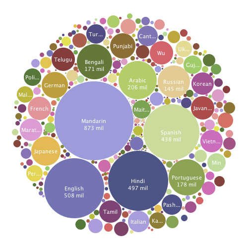
The "Languages Speakers" bubbles by Manyeyes- via Sinosplice.

- If you need some clean charts and graphs, try Swivel. Your data has to be public and shared. To keep it private you'll have to pay monthly. Swivel is a good online solution, with many ready-to-use visualization compatible with many kind of data, including Google Analytics. The layouts and customization could not be sufficient if you want something graphic. The interface is clear and data manipulations are easy. Maybe we should like to have an option to export the graph in PDF or JPG, but you can share it online anyway.
- See also Tableau Public. This you will have to download, but the result is impressive. Many newspapers and scientific communities already use it. Tableau was a tool for professional and with the release of the public version, anyone is able to create and edit graphs and maps easily.Your data will also become public, but if you don't mind you'll enjoy the drag&drop interface. It's pleasant to use and very stable, with a lot of delectable options like multi-spreadsheets for instance. The only matter is that it is not Mac compatible.
Look at this History of the World Cup published by Ross Pere.
- Another one is Rich Chart Live. This will give only help you for charts and pies, but you'll easily be able to add interaction and clear annotations on it. You can also play during hours with the graph styles and animation proposed by the website or create quickly yours. It's up to you... You will be able to export it to Flash format (swf), Powerpoint or embed it directly on your blog. You can also save it to complete it later.